
Understanding WordPress Landing Pages and Conversion Goals

To successfully build an online presence, one must first master the architectural distinction between a standard website page and a dedicated WordPress landing page. A standard website page—such as your homepage, “About Us” section, or blog archive—serves as an informational hub designed for broad exploration. It typically features global navigation menus, footer links, sidebars with recent posts, and multiple pathways guiding the user across various sections of your domain. In stark contrast, a WordPress landing page is a highly focused, standalone web environment purposefully built around a single marketing campaign, traffic source, or conversion goal. Whether your objective is capturing email leads for a newsletter, registering attendees for a webinar, or selling a specific digital product, every design element on this page must work cohesively toward that single desired action. This foundational philosophy shifts your web design approach from general information delivery to aggressive conversion optimization.
The psychological mechanics behind why landing pages outperform standard pages lie in visitor behavior and cognitive load. According to a landmark usability study published by the Nielsen Norman Group in 2020, modern web users scan pages rapidly and abandon sites within seconds if they experience cognitive overload or confusion regarding what action to take. When a visitor arrives via an external advertisement, social media post, or promotional email, they carry high intent tied directly to the promise made in that specific promotional link. If they land on a cluttered page featuring competing navigation items, dropdown menus, and unrelated blog widgets, their attention fractures. By intentionally stripping away the standard header navigation, sidebars, footer links, and secondary promotional banners, you eliminate digital “escape hatches.” This deliberate reduction in friction forces the visitor’s focus squarely onto the primary conversion goal, vastly increasing the likelihood of goal completion.
Before touching a single pixel of your layout or selecting a visual builder, you must precisely define your primary conversion goal and align every textual and visual asset to it. Multiple competing calls to action on a single landing page—such as asking a user to subscribe to a blog, follow your social media profiles, and purchase a product all at once—will inevitably paralyze decision-making, a phenomenon known in behavioral economics as the paradox of choice. Instead, your headline, supporting body copy, visual imagery, form fields, and call-to-action button must form an unbroken chain of relevance. If your ad promises a free whitepaper on search engine optimization, the landing page headline must immediately reiterate that exact promise, followed by concise supporting copy explaining the value, a clean input form, and a high-contrast button reading “Download Free Whitepaper Now.” This meticulous alignment ensures that visitors never second-guess their location or purpose.
Laying this strategic foundation is also a crucial prerequisite for effective site design and overall marketing infrastructure within the WordPress ecosystem. When you separate your conversion assets from your core architectural template, you gain the freedom to experiment with radical visual hierarchies, custom typography sizes, and unconventional whitespace ratios that might look out of place on a standard blog post or corporate service page. Furthermore, keeping your conversion pathways isolated allows you to run precise split tests (A/B testing) without polluting your main traffic analytics. According to conversion rate optimization data released by Unbounce in their 2023 conversion benchmark report, landing pages that maintain strict alignment between message, intent, and visual focus achieve average conversion rates that are up to double those of standard internal pages driving the same traffic.
Ultimately, mastering the creation of custom landing pages in WordPress without coding begins with this strict mindset shift. You are no longer designing a digital brochure for general browsing; you are constructing a conversion funnel translated into visual web design. Every element—from the absence of top-level navigation links down to the exact shade of your primary action button—must be engineered to serve the campaign. By understanding these core principles of focus, message matching, and distraction elimination, you establish a rock-solid groundwork that will make your subsequent design choices in WordPress far more effective, ensuring your digital campaigns yield maximum return on investment.
Choosing the Right Page Builder and Native Editing Tools
The architectural foundation of any high-performing custom landing page in WordPress begins with how you choose to construct its layout. Historically, web creators had to manually code Hypertext Markup Language and Cascading Style Sheets or rely on complex, shortcode-heavy frameworks that frequently broke when themes updated. Today, however, the digital landscape has shifted dramatically toward visual composition tools. A robust page builder provides an intuitive, visual way to assemble complex layouts from pre-built blocks or interactive widgets, allowing users to dynamically adjust global styles, tweak typography, control spacing, and preview the final output in real time without writing a single line of page code. When evaluating these visual systems, it is essential to choose an ecosystem that fully supports granular responsive controls—ensuring your mobile, tablet, and desktop views look immaculate—and that harmoniously integrates with your active WordPress theme to prevent layout shifts or cascading stylesheet conflicts.
At the core of modern WordPress architecture sits the native block-based editing environment, commonly known as Gutenberg. According to WordPress.org’s core usage statistics published in 2024, the native block editor powers over 60 percent of newly published pages across the millions of active WordPress installations globally. This native system lets site administrators and content creators compose landing page content directly from core blocks rather than relying on custom HTML snippets, PHP template overrides, or legacy shortcodes for routine layouts. For simpler promotional campaigns, minimalist sign-up pages, or standard text-and-image destinations, it is wise to carefully compare the built-in block editor with an external, feature-rich page builder before installing another third-party plugin that might increase server payload. If you plan to extend native capabilities, you can evaluate specialized tools like the Landing Page Builder plugin to handle coming soon screens and maintenance modes, or utilize specialized visual suites like Marfilo – Visual Page Builder when crafting intricate headers, footers, and mega menus.
To better understand how these visual frameworks differ in practice, we can break them down into two distinct operational paradigms: dedicated third-party drag-and-drop page builders and the native WordPress site editor block system. Each methodology caters to a specific workflow style, technical skill level, and performance budget.
| Feature / Capability | Third-Party Visual Page Builders | Native WordPress Block Editor |
|---|---|---|
| Interface Complexity | Highly visual, floating panels, drag-and-drop canvas, absolute positioning options. | Streamlined, inline text editing, structured block sidebar settings, minimalist canvas. |
| Design Flexibility | Advanced global styling, motion effects, custom shape dividers, and complex nested columns. | Relies on theme JSON configurations, pattern libraries, and core layout blocks for styling. |
| Performance Impact | Can add extra HTTP requests and heavier DOM structures if loaded globally without optimization. | Extremely lightweight, outputs clean HTML5 markup directly into the database. |
| Learning Curve | Moderate to steep; requires familiarization with proprietary UI layouts and widget libraries. | Minimal; follows standard WordPress authoring workflows familiar to most content teams. |
When configuring your custom landing pages, striking the right balance between visual freedom and site speed is paramount. A study published by HTTP Archive in 2023 demonstrated that landing pages built with bloated, poorly optimized page builder setups suffered from a median First Contentful Paint delay of over 3.2 seconds, negatively impacting user retention. To mitigate this, developers should look for builders that feature conditional asset loading—meaning they only load CSS and JavaScript files on pages where those specific blocks are actively rendered. Furthermore, if your primary goal is building advanced marketing funnels with sophisticated conversion elements, studying resources such as our guide on How to Build a High-Converting WordPress Site with Elementor can provide actionable frameworks for optimizing heavy design tools without sacrificing loading velocity.
As you finalize your workflow setup, remember that selecting a visual editor is not merely a matter of feature checklists, but a long-term maintenance decision. Every plugin you introduce—whether it is a specialized landing page creator or a broader utility tool—becomes part of your site’s core dependency tree. Before committing to a specific architectural path, consult comprehensive technical manuals such as What Is a WordPress Plugin and How to Choose the Best Ones to evaluate plugin coding standards, developer update frequency, and community support metrics. By meticulously aligning your project requirements with either native block editing or a dedicated visual layout engine, you establish a resilient, scalable foundation for every custom destination page you build.
Leveraging Templates and Custom Web Design Principles
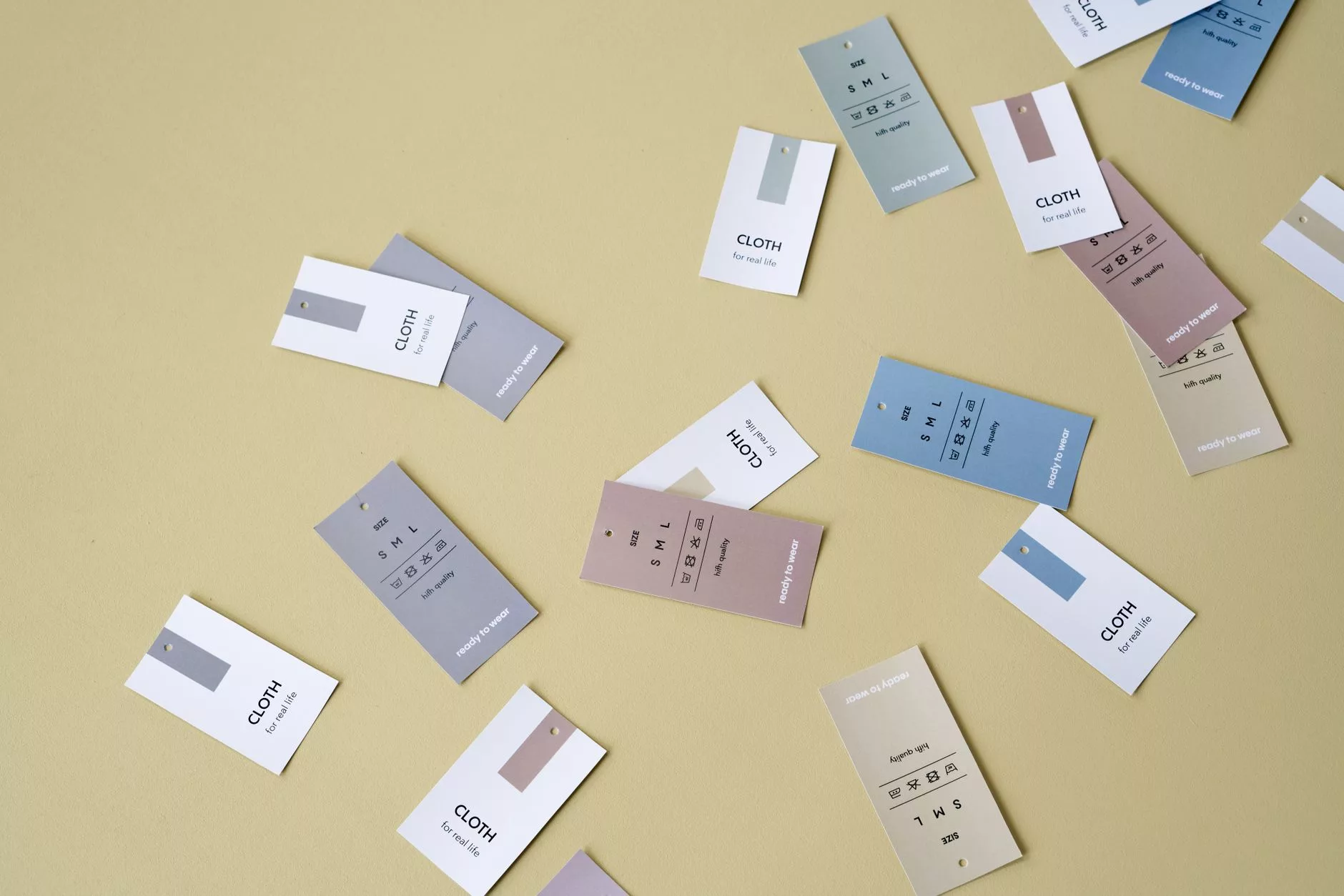
When embarking on the journey to build a high-converting landing page in WordPress without touching a single line of code, the absolute fastest way to accelerate your workflow is by utilizing professionally designed pre-built templates. Modern drag-and-drop page builders and block editors come heavily stocked with hundreds of layouts explicitly crafted for lead generation, webinar sign-ups, product launches, and service inquiries. However, novice creators often fall into the dangerous trap of treating these pre-fabricated layouts as finished masterpieces rather than what they fundamentally are: a structural framework. To achieve true conversion success, you must start with a landing-page template, then methodically replace its placeholder copy, images, color schemes, and call-to-action buttons with campaign-specific content tailored explicitly to your unique audience. A template is merely a starting point, never a complete substitute for thoughtful custom web design.
The primary advantage of deploying a template lies in structural psychology and visual hierarchy. Professional designers spend countless hours analyzing how human eyes scan a digital screen, organizing typography scales, white space, and element placement to guide visitors smoothly toward a conversion goal. By leveraging these pre-engineered structures, you eliminate the daunting blank-page syndrome and bypass the tedious mathematics of grid layouts and responsive breakpoints. Yet, relying blindly on default template assets can severely damage your brand credibility. If hundreds of other businesses use the exact same stock photograph of a smiling customer service representative or the identical neon-purple accent color, your landing page instantly loses its distinct market positioning. Customizing every structural component ensures that your visual identity remains cohesive with your broader digital ecosystem, which you can further harmonize by reviewing foundational site design best practices before launching your campaign.
To execute a successful transformation from generic template to high-converting asset, adopt a systematic, top-to-bottom replacement strategy. Begin with the typography and textual narrative. Placeholder text—often disguised as classic Latin filler or generic benefit statements—must be ruthlessly excised and replaced with sharp, compelling copywriting that addresses the specific pain points of your target demographic. According to a comprehensive usability study published by the Nielsen Norman Group in 2023, digital users spend an average of only 5.59 seconds reading the above-the-fold content of a landing page before deciding whether to stay or bounce. This means your primary headline and subheadline must be immediately rewritten to communicate immediate value, stripping away any corporate jargon or template-induced fluff. Furthermore, update all imagery to reflect authentic products, real team members, or bespoke graphic illustrations that visually reinforce your core offering rather than relying on cliché, overused stock photos that scream “template.”
Beyond surface-level aesthetics and text substitution, deeply integrating your landing page into a cohesive digital architecture requires aligning it with professional sites development standards. A visually stunning template will fail instantly if the underlying page speed is compromised by bloated code or unoptimized image files. As reported in a performance benchmark study released by Google in 2024, a staggering 53 percent of mobile site visitors will abandon a page if it takes longer than three seconds to load. Therefore, when customizing your chosen WordPress template, you must aggressively compress all visual assets, limit unnecessary animations, and strip out extraneous layout sections that do not serve a direct conversion purpose. Remember that every single widget, plugin-driven slider, or decorative icon box adds HTTP requests and processing weight. Stripping down a template to its leanest, most functional state exemplifies superior custom web design, ensuring that form strictly follows function.
Another critical dimension of effective template adaptation is iterative refinement through empirical testing rather than pure aesthetic guesswork. Too many creators launch a customized template based entirely on subjective internal preferences, assuming that because they like a particular shade of blue or a specific hero image, the market will respond accordingly. In contrast, data-driven optimization relies on structured split testing. According to a conversion rate optimization report published by HubSpot in 2023, businesses that systematically run A/B tests on their landing page layouts and calls-to-action experience an average lead generation increase of over 30 percent compared to those that publish a single static version and never look back. When you adapt your WordPress template, design it with modular sections that can be easily duplicated, tweaked, and tested. Swap out button colors, rearrange the sequence of trust signals like customer testimonials and security badges, and test contrasting value propositions to let your actual audience dictate the final iteration of your design.
Ultimately, mastering the balance between pre-built efficiency and bespoke customization is what separates amateur web builders from professional digital marketers. A template provides the scaffolding, the grid, and the initial momentum, saving you dozens of hours of layout math and structural configuration. However, the soul, the persuasive power, and the conversion efficacy must come from your own strategic messaging, brand voice, and audience research. By treating the template as a flexible canvas rather than an immutable law, you harness the speed of modern no-code WordPress tools while maintaining the strategic integrity of genuine custom web design. Take full advantage of these frameworks, but never forget that your brand is unique—and your landing page should prove it to every single visitor who arrives from your advertising or organic channels.
Configuring Full-Width Layouts and Responsive Settings
When designing high-converting Landing pages in WordPress without writing a single line of code, achieving a distraction-free user experience is paramount. Standard blog layouts often include sidebars, widgets, author boxes, comment sections, and generic headers or footers that pull the visitor’s attention away from the primary conversion goal. To build a true, high-impact landing page, you must strip away these extraneous elements and construct a clean, edge-to-edge canvas. The first technical step in this process involves configuring your page or theme settings to establish a full-width or blank canvas layout. Most modern WordPress themes—along with popular visual page builders like Elementor, Beaver Builder, or Divi—provide built-in template options specifically designed for this purpose.
To implement this layout shift, navigate to the editing screen of your specific landing page within the WordPress dashboard. Look for the page attributes or theme settings panel, which is typically located in the right-hand sidebar. Here, you will find a dropdown menu for “Page Template,” “Template,” or “Layout.” Select options labeled “Full-Width,” “Landing Page,” “Canvas,” or “Blank.” It is vital to understand that different themes use different naming conventions; a “Full-Width” template in one theme might still display the main site header and footer, whereas a “Blank” or “Canvas” template will typically remove the site header, navigation menus, footers, and sidebars entirely, leaving you with an empty viewport to design within. Always confirm what the selected template actually hides before publishing your page live to avoid an embarrassing user experience where your primary menu still distracts visitors. If your theme does not offer a native blank canvas, you can utilize your page builder’s global settings or template overrides to suppress these structural elements on a per-page basis.
Once your canvas is properly isolated and cleared of standard theme clutter, your next crucial responsibility is ensuring that your design translates seamlessly across every device category. According to a landmark 2023 study by Adobe examining global web traffic habits, mobile devices account for over 58 percent of all web traffic worldwide, meaning that a desktop-only design approach guarantees a high bounce rate and poor conversion performance. Relying solely on the desktop canvas while building your WordPress landing page is a critical mistake that will undermine your marketing campaigns. Modern page builders include dedicated responsive editing modes that allow you to toggle between desktop, tablet, and mobile views instantly with a single click.
To properly execute your responsive design workflow, switch your page builder canvas to mobile view after you have finished placing your primary elements on the desktop version. At this smaller viewport width, you must carefully check that every single text block, button, image, and lead capture form remains completely usable, legible, and visually balanced. Pay special attention to typography scaling; a headline that looks commanding and proportional at 48 pixels on a 1920-pixel desktop monitor will often overflow mobile screens or wrap awkwardly on a 375-pixel smartphone viewport. Most professional page builders enable you to adjust font sizes, padding, margins, and column reversing specifically for mobile and tablet devices without affecting your desktop layout.
Furthermore, interactive elements such as contact forms and call-to-action buttons require rigorous hands-on testing across all three primary screen widths. Form fields that stretch edge-to-edge on desktop might look acceptable, but on a tablet or mobile device, they can suffer from awkward padding issues, overlapping labels, or submit buttons that require excessive scrolling to locate. Test every interactive element by clicking, tapping, and typing directly inside the responsive preview window of your builder. Additionally, examine your image assets to ensure they do not force horizontal scrolling or load oversized files that degrade page load speeds on cellular networks. By methodically verifying your custom layout and systematically reviewing responsive breakpoints for desktop, tablet, and mobile sizes, you guarantee a polished, professional, and conversion-optimized experience for every visitor who arrives at your site, regardless of the device they happen to be using.
Modern 2026 Standards: Core Web Vitals, Performance, and Platform Updates

As digital experiences continue to evolve, building custom landing pages in WordPress requires a strict adherence to contemporary performance benchmarks and modern platform capabilities. The landscape of web design has shifted drastically away from bloated, heavy page builders toward streamlined, native approaches. To maintain competitive conversion rates and search visibility, creators must understand how foundational platform updates intersect with strict user experience metrics. If you are questioning the platform’s viability in the current ecosystem, you can read more about whether WordPress is still worth it in 2026 to see how its architecture adapts to modern demands. Building a high-converting landing page is no longer just about visual appeal; it requires deep technical optimization across speed, responsiveness, and structural efficiency.
Platform-level advancements play a crucial role in achieving these optimization goals. According to WordPress.org’s release notes, WordPress 6.8 introduced native speculative loading and substantial refinements to the Style Book, features designed to drastically streamline both the backend design workflow and front-end navigation speeds. Speculative loading anticipates user actions by prefetching pages before a click actually occurs, shaving milliseconds off navigation times and creating an instantaneous feel for potential customers landing on your promotional offers. Meanwhile, the updated Style Book provides granular control over design tokens, ensuring that global styles remain consistent without requiring custom CSS overrides that typically bloat stylesheets. However, these native improvements do not completely replace rigorous testing; creators must still evaluate the published page across multiple devices and connection speeds to ensure these architectural advantages translate into a seamless user experience.
Beyond platform features, meeting strict performance benchmarks mandated by search engines is essential for capturing traffic and maximizing return on ad spend. Google’s web.dev Core Web Vitals guidelines establish rigorous thresholds that dictate how a landing page is evaluated and ranked. Specifically, Google’s web.dev documentation sets “good” performance targets for three foundational pillars: Largest Contentful Paint (LCP) must occur at 2.5 seconds or less, Interaction to Next Paint (INP) must remain at 200 milliseconds or less, and Cumulative Layout Shift (CLS) must be kept at 0.1 or less. To diagnose and resolve bottlenecks standing in the way of these benchmarks, developers should regularly use diagnostic tools like PageSpeed Insights or Google Search Console to identify issues on a published page before driving paid traffic to it.
Understanding the nuance of these metrics is particularly critical for interactive elements such as call-to-action buttons, lead generation forms, and modal popups. According to Google’s web.dev documentation, INP officially replaced First Input Delay (FID) as a Core Web Vital, shifting the measurement paradigm from a single initial interaction to a comprehensive evaluation of page responsiveness. When evaluating a landing-page responsiveness score, developers must test interactions throughout an entire user visit rather than checking only the first click. A landing page might load quickly, but if a form submission or a tab-switching action lags during the user session, the poor INP score will penalize the page’s overall user experience rating and depress conversion rates.
Asset management and media optimization remain primary drivers of these performance scores. Creators must aggressively compress and appropriately size large images, and completely avoid autoplaying video backgrounds on landing pages. According to web performance insights published by Google, oversized visual assets and unnecessary stylistic effects can severely slow a landing page down, causing them to directly compete with and dilute its main marketing message. High-resolution product mockups and hero images should be converted to next-generation formats like WebP or AVIF, and explicit width and height attributes must be defined to prevent layout shifts that ruin the CLS score. By pairing the native speed optimizations of modern WordPress core updates with disciplined media handling and regular Core Web Vitals audits, you can build exceptionally fast, high-converting landing pages completely without code.
Optimizing Bloat and Testing the Conversion Path
When building custom landing pages in WordPress without writing code, it is remarkably easy to fall into the trap of over-engineering. Modern visual page builders offer an array of alluring widgets, motion effects, sliders, icon boxes, and third-party extensions. However, every added element introduces extra HTTP requests, external stylesheet calls, and bulky JavaScript files that directly degrade site performance. According to Google’s page experience research, as a page load time increases from one second to three seconds, the probability of a mobile user bouncing increases by 32 percent. To safeguard your advertising ROI and organic traffic, you must maintain a disciplined approach to asset management. Keep your page builder and its add-on ecosystem strictly limited to the core features required to communicate your value proposition. Before publishing any campaign, audit your page using diagnostic tools. When you introduce complex widgets, animated text modules, or embedded video players from third-party services, perform a fresh performance test to measure the impact on your Core Web Vitals. If an animation adds negligible value to the user experience but delays the Largest Contentful Paint by half a second, remove it immediately. For deeper insight into managing third-party tools efficiently, refer to our guide on What Is a WordPress Plugin and How to Choose the Best Ones to understand how to evaluate code weight, developer reputation, and resource consumption before installing extensions on your production environment.
Beyond keeping the frontend lean, ensuring absolute technical reliability across your entire conversion pathway is non-negotiable. A visually stunning landing page that fails to capture data or deliver assets to your sales team is worse than having no page at all. Before driving paid media traffic or organic outreach to your new asset, execute a thorough pre-launch checklist that systematically tests every possible user interaction. Never assume that a drag-and-drop form module is working out of the box simply because it renders correctly on your desktop screen. You need a rigorous testing protocol that mirrors actual user behavior across multiple devices, operating systems, and browsers.
To execute a flawless campaign launch, structure your pre-launch quality assurance process around the following core verification steps:
- Form Submission and Validation: Fill out every input field on your lead capture form using both valid data and deliberately invalid entries (such as malformed email addresses or missing mandatory fields) to verify error messaging.
- Confirmation States: Confirm that successful submissions trigger the correct user experience, whether that is an on-page success notice, a dynamic inline modal, or an automated redirection to a dedicated thank-you page.
- CRM and Notification Delivery: Verify that lead data successfully passes into your Customer Relationship Management (CRM) platform, email marketing software, or internal notification inbox without missing custom field parameters or UTM tracking tags.
- Tracking and Analytics Fire Verification: Inspect your Google Analytics, Meta Pixel, or alternative tracking tags using browser developer tools and extension inspectors to guarantee that conversion events and goal completions fire accurately upon submission.
- Link and Resource Integrity: Click every hyperlink, button, privacy policy reference, and supplementary asset download link to eliminate broken 404 errors or dead ends.
- Mobile Button Usability and Touch Targets: Test the primary call-to-action buttons on actual mobile hardware to ensure touch targets are adequately sized, thumb-friendly, and completely free from layout shifts or overlapping elements.
Mobile optimization deserves special scrutiny during this phase. According to a study published by Baymard Institute, mobile form abandonment rates frequently exceed 68 percent when layouts suffer from poor touch target spacing, unresponsive form fields, or invisible keyboards that obscure the submit button. When reviewing your mobile layout, make sure your primary conversion button remains sticky or easily reachable within the natural thumb zone of a standard smartphone screen. Check that input fields do not trigger aggressive automatic zooming on iOS devices, which can disorient users and break the visual hierarchy of your carefully designed layout.
Finally, remember that infrastructure stability plays a massive role in maintaining high conversion rates once your campaigns go live and traffic surges. If your hosting server struggles to process concurrent database requests during peak advertising hours, your landing page will slow down, resulting in abandoned sessions and wasted ad spend. Pairing a lightweight, optimized page builder workflow with robust server infrastructure is essential for long-term marketing success. If your current hosting environment struggles to handle traffic spikes or fails to provide adequate caching layers, explore professional options like our Support & Hosting solutions to ensure your landing pages load instantly, maintain 99.9% uptime, and deliver a frictionless experience to every prospective customer who clicks your ads.